ITS Help
User Experince/ User Interface Design
Overview
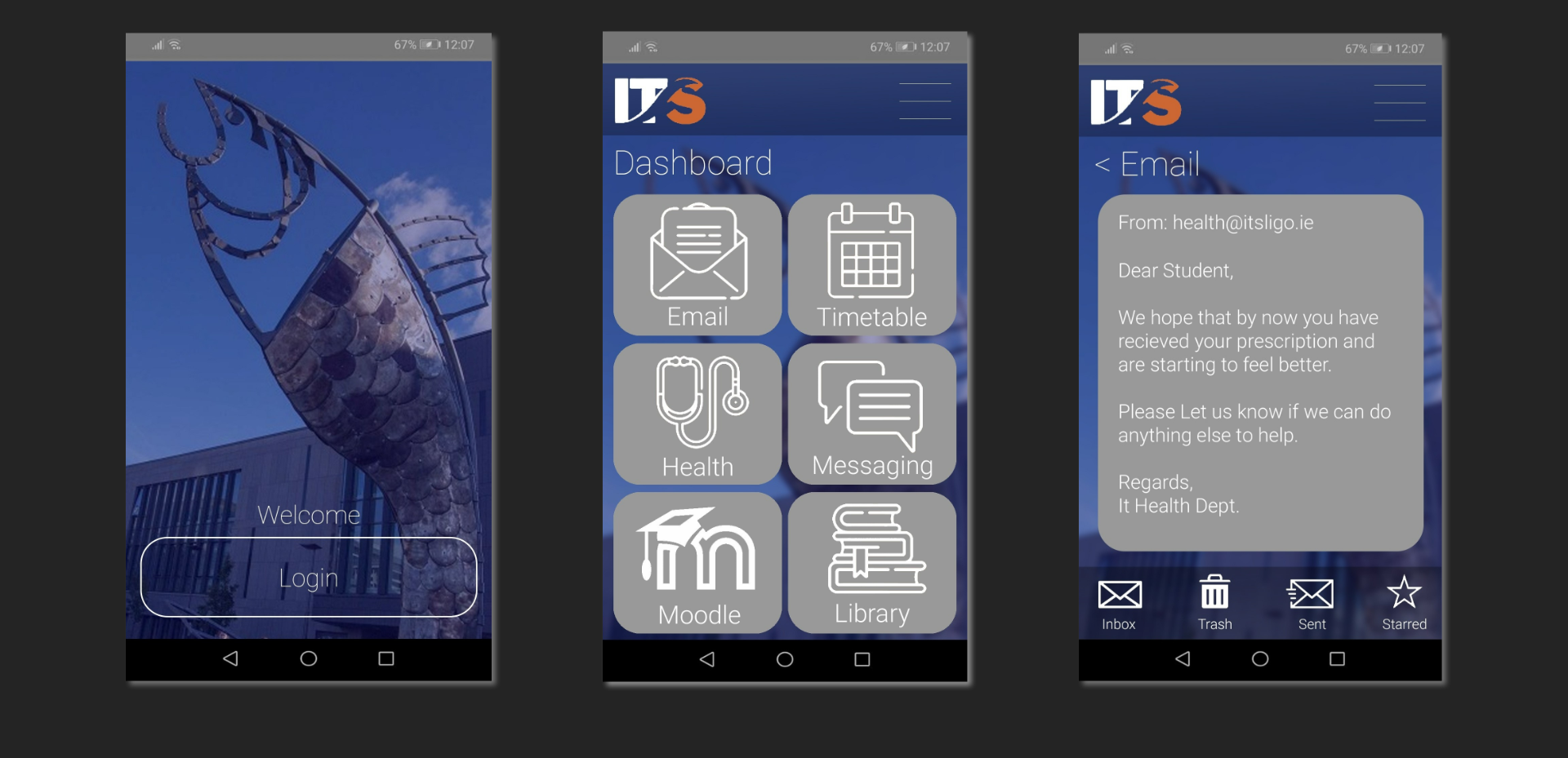
To create an all-in-one App to streamline student life. This app could be downloaded by students at orientation and would feature quick and easy access to scheduling, assignments, student email, health services and much more. This app idea was built around a new method of using the IT Sligo student health services.
Design Keywords
Students; Convienient; All-In-One; Streamlined
Empathy & Problem Definition
The initail Problem
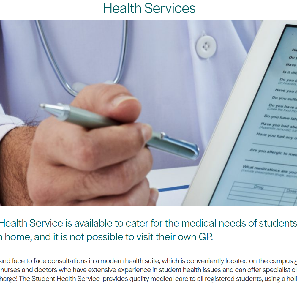
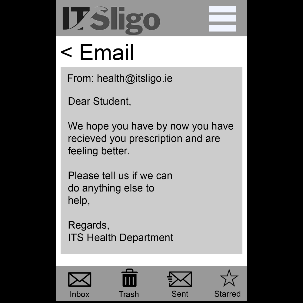
Starting this project the promp was simply "To prototype a user-centred on-line presence for the I.T. Sligo Health Service". The task to be completed was simply "Renew an existing prescription".
Research
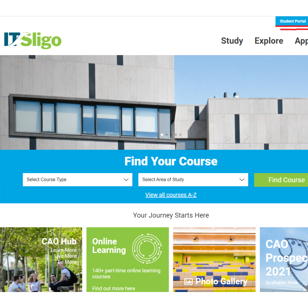
Initial Research began by doing investigating the current offering available for the IT health services. All finding observations were noted, these will be used for later use.
User Testing
To further expand the research, a group of test users was assembled to test the service and provide more responces which can be later organised into finding a better and more user focused solution to the problem.
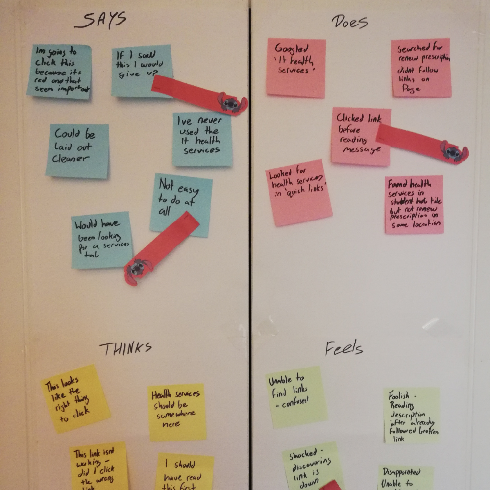
Empathy Mapping
With all this data gather the next step is to organise the data and make use it to solve our problem. To do this an empathy map is created. This will contain what the user says, thinks, does and feels.
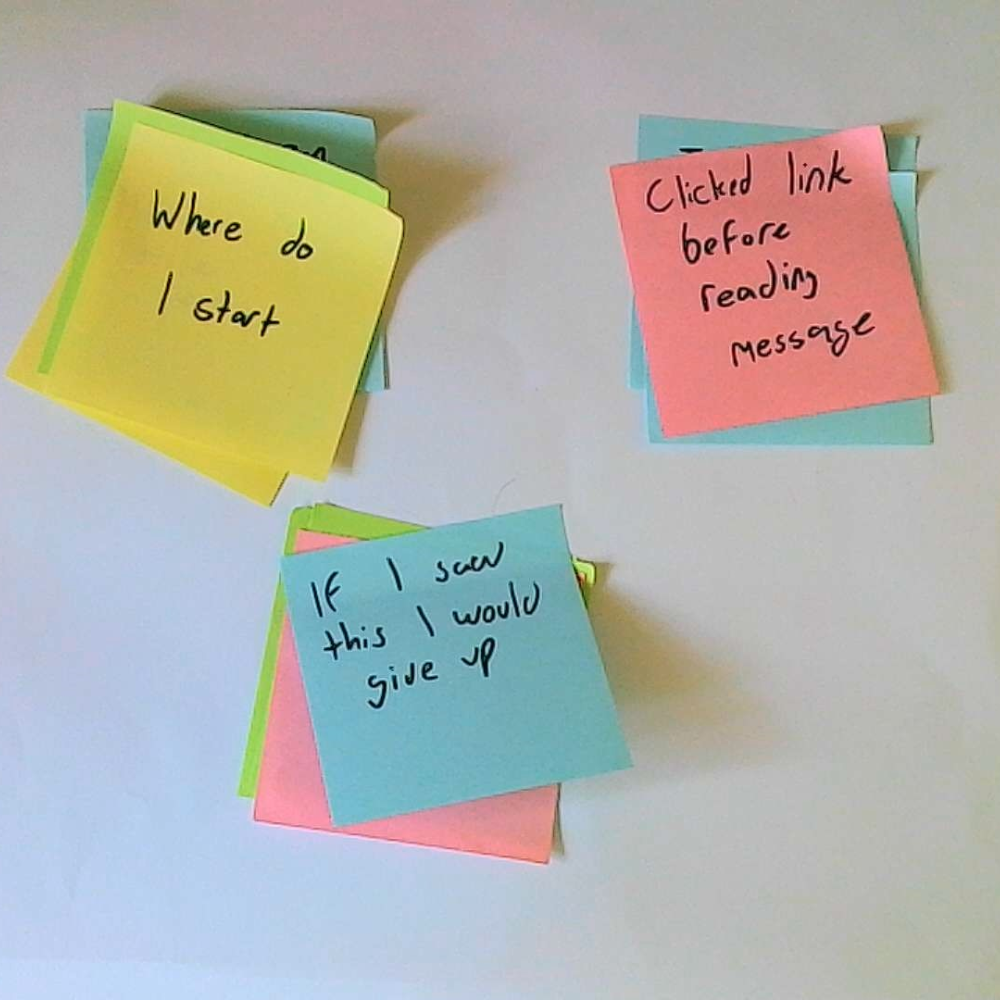
Affinty Diagram & User Pain Points
From the empathy map. Similar points are grouped together into an affinty diagram. These points will become the user pain points, these are the most important areas of improvment for the new site. These new pain points are: 1. Process was not easy 2. Messages along the process are ignored 3. Users do not have a clear starting point
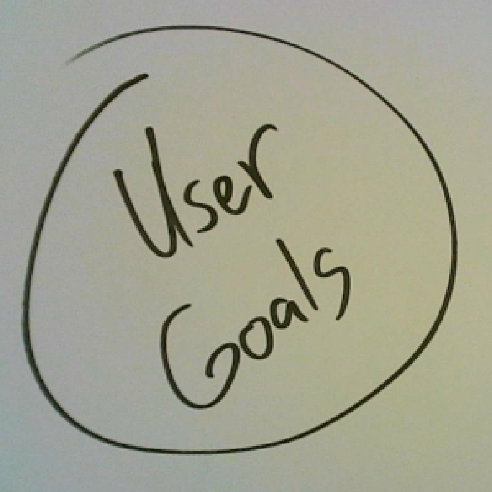
User Goals
With the user Pain points established, we have a clear idea of the problems the user is having. So fixing the issues is simple. J ust do the opposite if the pain points. This is now the user goals. For this project the user goals are: 1. Process needs to be simplified and made clearer 2. Important message need to be shown clearer. 3. An easier to find facility needs to be made. These goals will help guide the design in future steps.
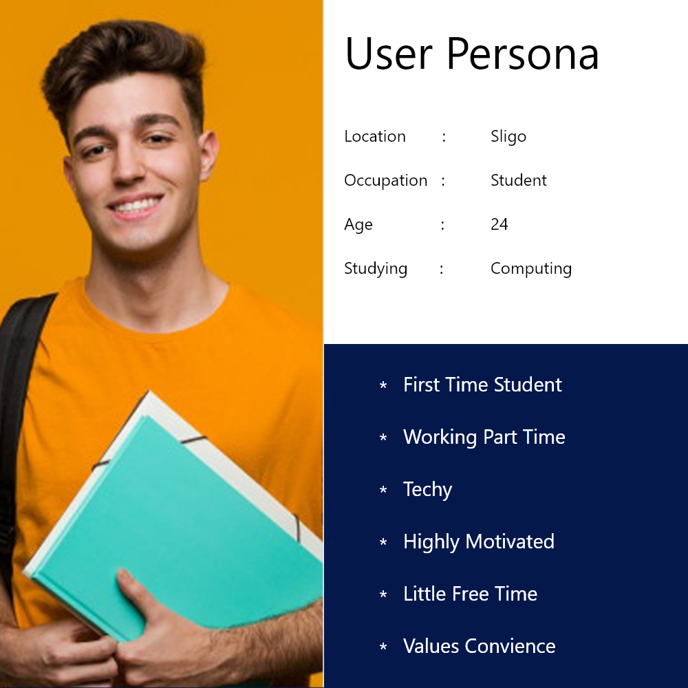
User Persona
To keep the user as the point of pocus for the design. A user persona is created. The design will be made to suit this user. All design desicions and ideas will be made by keeping them in mind.
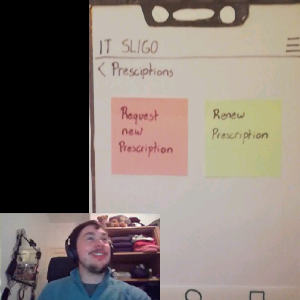
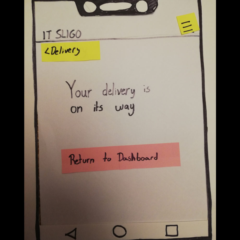
Low Fidelity Design

Lo-Fi Prototyping
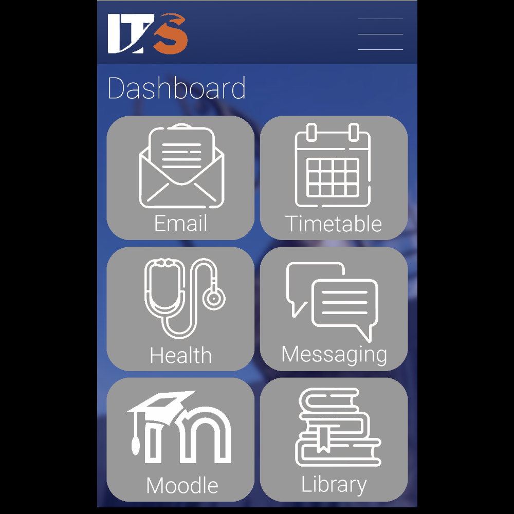
Upon review of the User Goals one of the most glaring areas of improvment would be "An easier to find facility needs to be made". To accomplish this it was decided a complete overhaul of the process would be the best option. This was accomplished by creating a new app that would serve as a one stop location for student life. This app would contain, everything from emails, a student messaging service, access to moodle for assignments and for our goal access to the IT health services.
Lo-Fi Testing
With the Lo-Fi prototype made, the next thing to do is to show it to users. This Lo-Fi tests will use the user base from the earlier stages, with all observations being recorded and noted for later improvements. This tests will also serve to test if the new app concept was successful.
Lo-Fi Iterations
After testing has been done and noted, based upon the user feedback improvments can be made. During these tests the app concept was determined to be a huge improvment over the existing services, however Users noting the simplicity and easy of use.
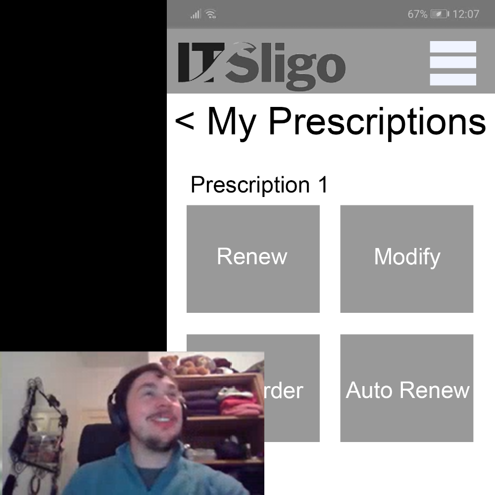
Mid Fidelity Design
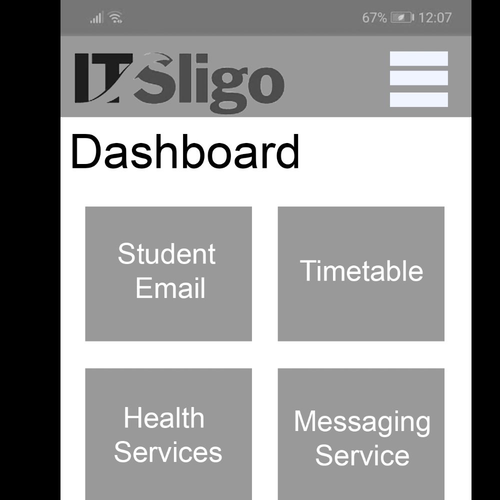
Mid-Fi Prototyping
With adjustments made and tested during Lo-fi prototyping the next step is Medium Fidelity prototyping. These are a more evolved version of the Lo-Fi prototype but features a more true to life UI. However this will not feature any images or colours to keep the user focused on the taask they are trying to proform with out distraction. This iteration will feature a more accurate in app feel to help the user along the process.
Mid-Fi Testing
Just Like the Lo-Fi Prototype before ther Mid-Fi Prototypes need to be tested by a group of users. Again tests are noted and all observations are being used for later improvment of the app.
Mid-Fi Iterations
Just as before any observations, strengths, weakness and suggestions from users were noted and used for alterations and improvments. These changes were then tested again to ensure the quality, and brought into the next steps of development. During these iterations the main focus was to simplify the process and remove some unessasy steps. For example, the prescriptions selection was changed from a dropdown selection to a list.
High Fidelity Design
Hi-Fi Prototyping
The Last and one of the most interesting phase of the design process is Hi-Fi Prototyping. With the user interactions completed this phase is fully focus on aesthetics. This phase is built from the Mid-Fi Prototype and is created by choosing colours and adding elements, effects and images to make the site feel whole.
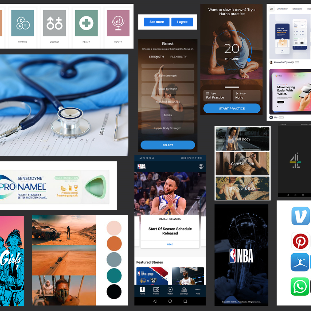
Moodboarding
To help keep the design in line and relevant to the user persona a mood board was created. This would contain images and screenshots from similar products. This will serve as a source of inspriation that will focus the design and find the correct look to appeal to the target demographic.
High Fidelity Prototype
Try my Finished High-Fi prototype here: